Little Pink Houses
Were you starting to worry that we had lost all the Blush Pink in our house? Never fear...the upstairs bathroom is here. Whenever you need a fix of Pink. Like a Mary Kay-1950s-Barbie-princess dream.
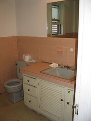
Here's the what it looked like when we bought the house (make sure to click through to see the photos of the tub and floors):
My research indicated that the best way to deal with an element like this is to add other strong features to balance it, making sure to use a few pieces that incorporate both/all colors. The added complication of the all-grey fixtures meant that there are a good number of colors schemes that wouldn't work. Our general preference for green was out, same with a sunny yellow, or even turquoise. What colors do you think go with pink and grey? I go right to black, white, silver. So basically, instead of trying to fight the existing colors, we're going with what's there.
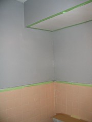
D. was busy being oriented to his new job and handling the tiling project, so this was my baby. We had agreed on using "Light French Grey" from the Classical/Colonial palette at Sherwin-Williams. It matched perfectly with the bathtub and toilet. I thought it was a little light, but it is a complementary color to the palette's "Aristocrat Peach," which is the exact color of our "pink" tile. I tested it, and it looked light but okay.
Check out the first coat:
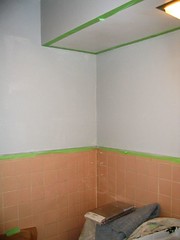
I knew I was going to have to buy more paint anyway, because I had stupidly bought only a quart. I didn't have enough for another coat on the walls or for the bottom of the vanity.
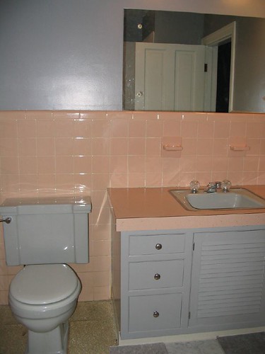
So I made a split-second, executive decision to switch colors. Okay, in the interests of full disclosure, I have to say that I think my quick decision to abandon "Light French Gray" was influenced by the fact that I had been seriously considering an alternative color that was significantly darker: "Whetstone" by Martha Stewart Signature.
Off I went to Sherwin Williams to get a gallon of that, then hustled to get a coat of "Whetstone" up. Here's what D. saw when he got home that night:
Another benefit was that I had an anti-mildew additive included in the second paint. I bleached out the patches of mildew above the shower, plus painted over with Kilz primer. But I feel safer with the additive, though I also think we need to add an exhaust fan. I hope it goes as smoothly as at Reviving the Colonial.
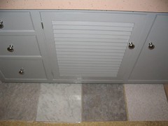
I'll post progress as we decorate with shower curtain, bathmats, accessories, and art, but for now, here's the completed paint job:
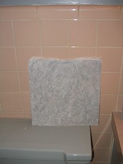
1) a smokey grey faux stone with a peachy-pink secondary tone, very matte finish, Armstrong but one of their less durable products, and costing only 78 cents per square foot,
2) faux grey and white marble, very high shine and a beveled edge, ended up looking more grey in our bathroom than in the store, the standard 98 cents a pop,
3) higher-end Armstrong "Terraza" faux stone, darker grey and only a hint of pink, more sheen than #1 and has a mortar effect, warranted for 25 years and less than a buck each, and
4)this was a stretch, but I like to test everything. A white and grey industrial look, same price: 98 cents.
Feel free to submit your thoughts. We really debated over #1 vs. #3. For now, the front-runner is #1, and not even because it is 20 percent cheaper:
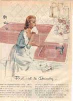
Actually, this ad was one of my inspirations, and I'm considering getting it framed to hang in the bathroom
That's my philosophy: embrace what you got. Fight pink with pink!
posted by K. @ 8:24 PM
2 comments
![]()


2 Comments:
I like your strategy. Our bathroom also has pink tile, which I at first thought was a 50's addition, but the more we look at the edges and how it's integrated, the more we think it is original to the house. (?) Anyway, I'm not really too fond of pink but I think we're just going to go with it, pairing it with a khaki/tan color and white. Your bathroom is looking good!
I cannot imagine the motivations that went into picking the grey toilet and tub to go with that pink tile- were people just tired of white fixtures? Was it in an era when only interior designers cared about interior design? I demoed our "Elvis" bath (circa 1950's or 1960's) which was yellow and cocoa brown- the problem with the tile jobs of 40 years ago is they were set in solid concrete with metal mesh and makes TONS of trash. Hard to demo, but worth it. And the yellow and brown is WAY worse than what you have there. FWIW, I like the dark tile for the floor.
Post a Comment
<< Home