Eureka
Thanks to serendipitous good fortune - or an inept Lowe's employee, depending on your perspective - we have found it! That spicy, vibrant, bold, bright, earthy, warm, relaxing hue we have been seeking for our dining room.
We love to cook, we want to host our new friends, and it seems like we really view our dining room as the center of our home. (Also, a dining room table and chair set that we inherited from D. grandmother is pretty much the only furniture we will have in the near future.) Because the living room, the den, and the kitchen all connect off of the dining room, we needed the orange before we could decide the colors for any of the other rooms.
We agreed to try a color called "Georgian Leather," but the Lowe's employee accidentally gave us the next darker color on the color swatch: "Mincemeat." We decided to give it a try.
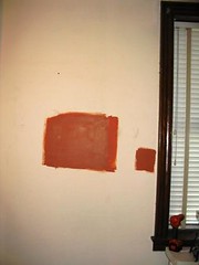
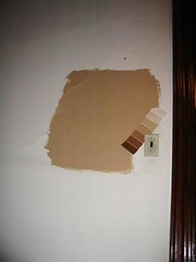
"Mincemeat," dining room
K: I love love love this color. It's not as dark or red as I the color I was shooting for, but it has all the elements I wanted. I know the pictures on the internet don't show the difference between this and the original orange, but it's much more earthy. I dislike the name. I'm a vegetarian, and it's not as bad as "Beef Broth." But mincemeat has always confused me - does it have meat or not? The color is much more of a Pumpkin Pie, so I think I will call it that!
D: I certainly understand why K. likes this color more than the original orange and I agree that this is a very nice color. If it was just me, I am not sure if I would prefer this to the first orange, but I am more than happy to go with it at this point. (Private to K: ever hear of using the internet to answer your questions?)
----------
Other colors from this third visit to the paint stores:
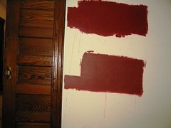
"Brick Dust," living room (the lower one)
K: Again, you can barely see the difference between these reds. But Brick Dust is sooooooo much better than Heirloom Red. It's more like brick than a Goth Girl's lipstick. If we choose red in the living room, this color would be great - and a good match to my beloved Pumpkin dining room. I've always dreamed of having a red room, and it's just sooooo Victorian. Interestingly enough, Apartment Therapy took on the issue of selecting red paint today.
D: For reasons previously discussed, I am simultaneously more drawn to the brighter versions of the colors and also completely understanding why they are likely to be a bad idea. Honestly, in some lights the two reds look exactly the same and in no light is there a huge difference, but the new color is definitely a bit chalkier and more muted which could be an advantage.
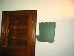
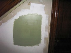
"Grape Leaves," living room
K: This is slight slight difference from the previous green. It is slightly darker and less "chalky." If we go with green in the living room, I definitely want "Grapes Leaves." It's a real contrast to Pumpkin Pie, in a good way. The reason to go green is because we love green. In all forms. It's our favorite color.
D: It's actually interesting how the difference between the two greens is similar to the difference between the two reds. In this case, the original one was more muted and the new one is deeper and more vibrant. I feel the same conflicts about these two as I did over the reds, though K seems to have figured out how to reconcile them in different ways in the two cases. At this point the real question to me is whether we want red or green in the living room in the first place.
"Ruskin Room Green," foyer
K: Speaking of green, this is the most perfect green color ever. I love it. It's our favorite shade of our favorite color and exactly the color I dreamt of having in our foyer. I'd love to see some gold stencil along the ceiling line to class it up a little more.
D: K and I are in prefect agreement on this. I could go a bit darker, but this is awfully close to the Official Color Of Our Wedding, and a longtime favorite color with us. I'm a bit shocked that we found a color on the first try, but I think we did it.
"Totally Tan," den
K: Unfortunately, this color is not really doing it for me. It's very pale, very neutral, where I wanted a richer, camelhair kind of tan. I can't figure it out, which colors go darker on the wall and which end up looking lighter than the chip. Is it something about Sherwin Williams? Or our particular SW store? I would be willing to go along with this color to save the trouble. My main concern would be that it means we'd need bolder furniture, whereas we had been imagining a tan or mushroom or sage couch.
D: When we saw the first try at a beige we wanted lighter. Now I agree that this is lighter than I really had wanted at first. But is there a chance of finding something in between the two? This color is completely fine and inoffensive, but I can't say it sings to me.
posted by K. @ 9:39 PM
1 comments
![]()


1 Comments:
I like the Heirloom Red better. My kitchen and family room are painted Rembrandt Ruby, one of the restoration colors from Sherwin-Williams. It's quite red, but it's GREAT! I had a bit of a hard time convincing my significant other that it was the right color, but sometimes the purer color is the one that works.
Post a Comment
<< Home